
Marketing Cloud · Journey Builder
The fourth-most-used feature, rebuilt as a system
I led the UX and product design to move Journey Builder off the original Marketing Cloud canvas and into Liquid Sky – 33 widgets, a new node language, and a phased ship that started with the journeys marketers actually create first.
The product worked. The experience had fallen behind.
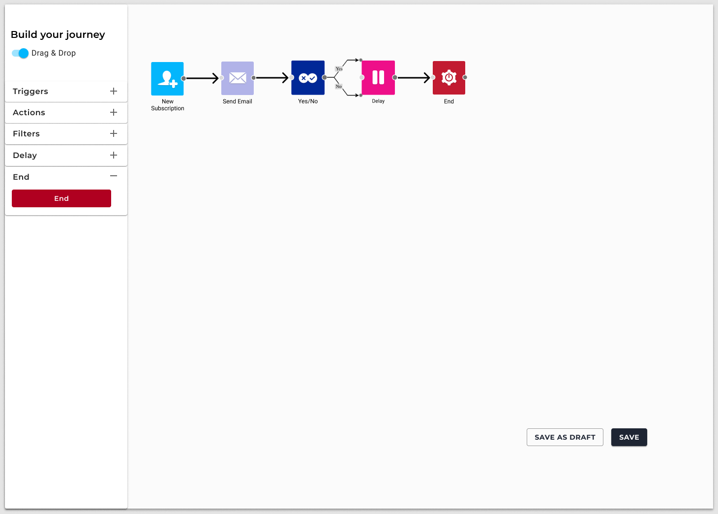
Journey Builder is how marketers automate revenue: a new subscriber waits, gets an email, splits on behaviour, waits again, exits. Teams still built journeys every day. It was the fourth-most-used feature in the cloud. The canvas they built on was the original Marketing Cloud UI – a dark grid of tiny icons, labels underneath, hover to understand, left-to-right only.
That was not a visual complaint. The rest of the platform had moved to Liquid Sky. Journeys had not. Prospects comparing us to Klaviyo or Keap met a builder that looked a generation behind. Internally, the old framework was also a security and delivery risk: every remaining legacy surface is a surface we cannot modernise, report on, or protect the same way.
The brief was not “make the boxes prettier.” It was: redesign the presentation layer so a marketer can read a journey at a glance, configure a node without losing the map, and so engineering can move thirty-three widgets onto Vue 3 without inventing a new pattern for each one.
Product outcome
A canvas people can scan, and a system engineering can ship
Cards at working zoom. Icons when you pull back. Configuration in a drawer, not a modal over the flow. Colour by job – trigger, action, filter, delay, end. Welcome, Abandoned Cart, Nurture, and Advocacy templates now land on the new canvas. Journeys created from scratch remain on the legacy builder until the remaining widgets catch up.
Before was recognition by hover. After is recognition on the card.
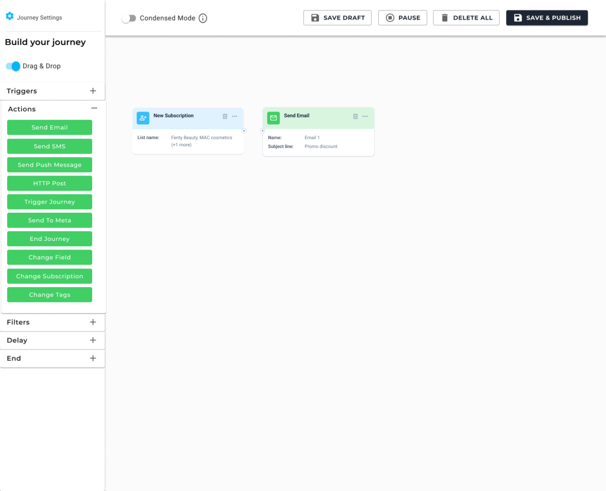
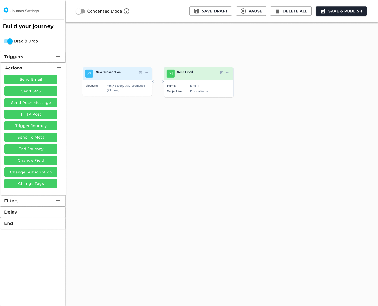
The old node was an icon with a caption. On a five-step welcome flow that is merely dated. On a branched post-purchase journey it is a memory test. The new node is a card: type, title, the one or two facts a marketer needs without opening it, and connectors on every side so complex journeys can go vertical.
Four decisions that made it a product, not a reskin
A reskin would have kept the same information architecture and painted Liquid Sky on top. That would have shipped faster and failed the actual job. These four calls are the design.
01 · Progressive disclosure
Cards at work. Icons at altitude.
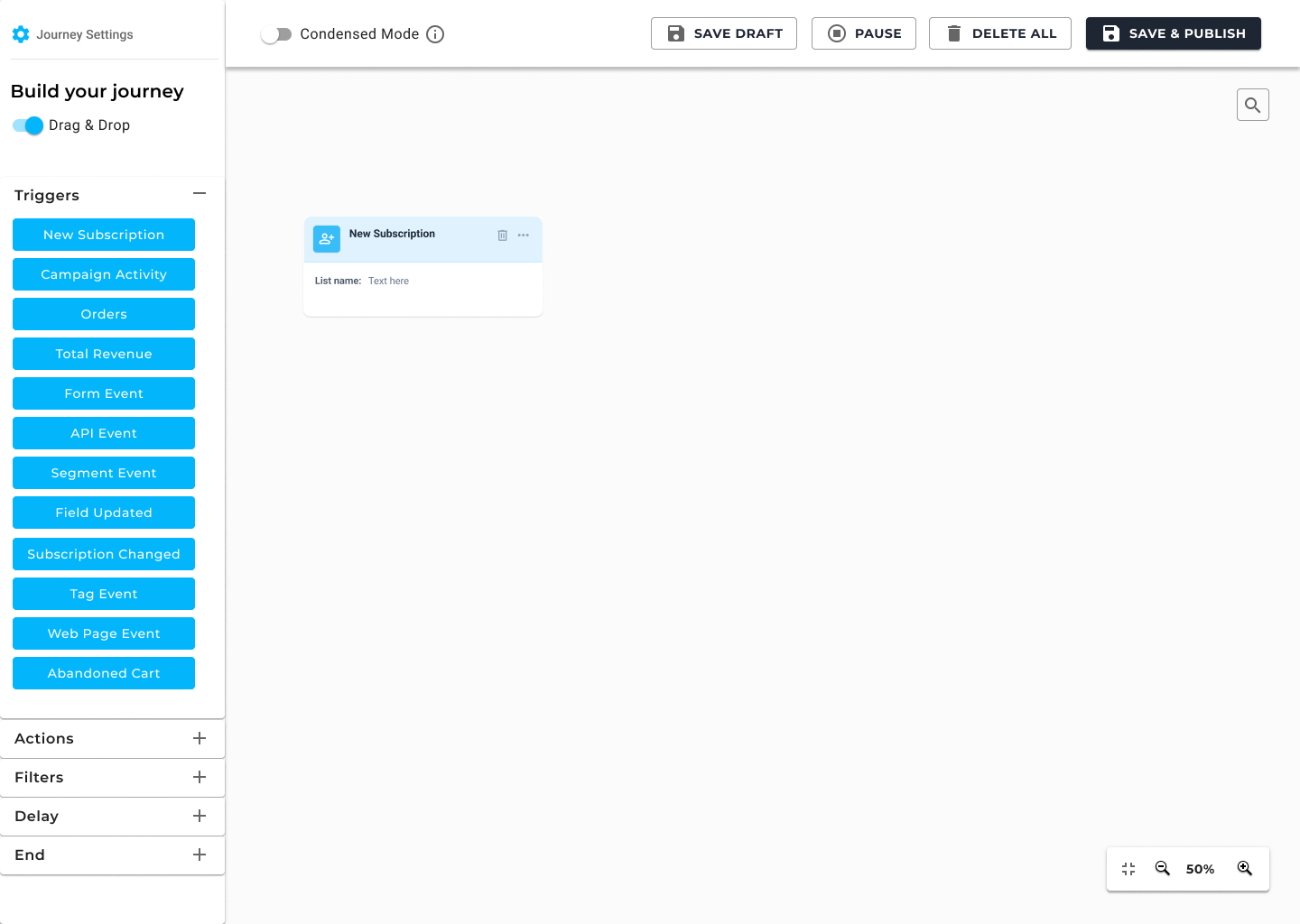
Cards at working zoom – enough metadata to audit the flow without opening drawers. Condensed Mode in the header collapses the same journey so a 40-node post-purchase map is still a map, not a wall of rectangles.
02 · Spatial memory
Configure in a drawer. Keep the canvas.
The old pattern covered the flow with a modal. Marketers lost their place. The new pattern docks config on the right: list, campaign, wait, content. Cancel and Save are local. The journey stays in peripheral vision.
03 · All-sides connectivity
Stop forcing left-to-right.
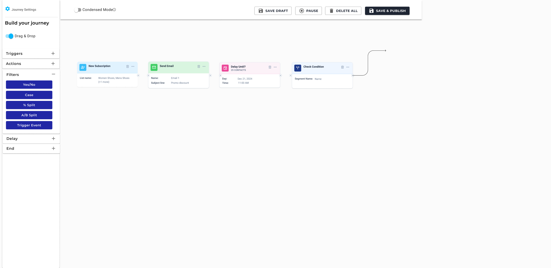
Real journeys are not a timeline. Filters split. Delays stack. Ends collect. Nodes connect from any side so a marketer can organise vertically without fighting the engine.
04 · One node contract
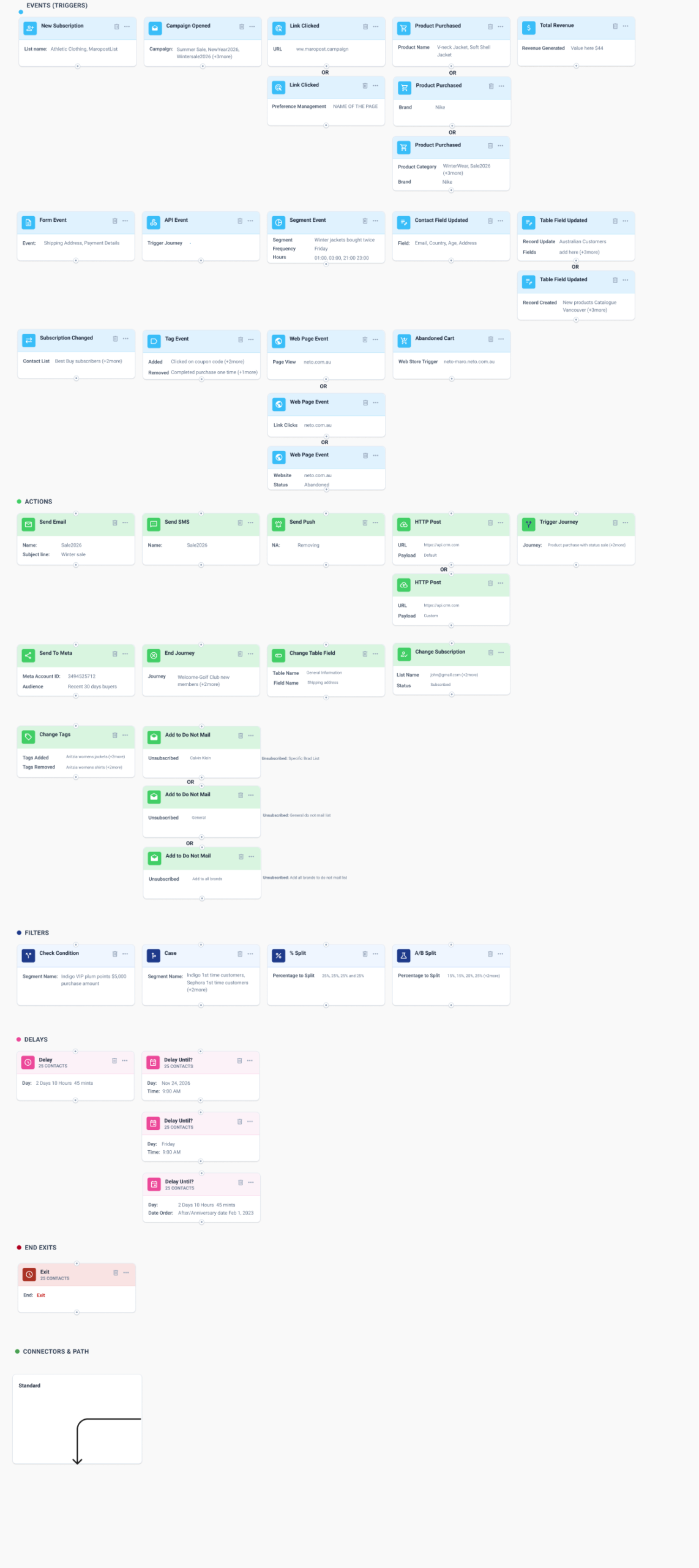
Thirty-three widgets, one anatomy.
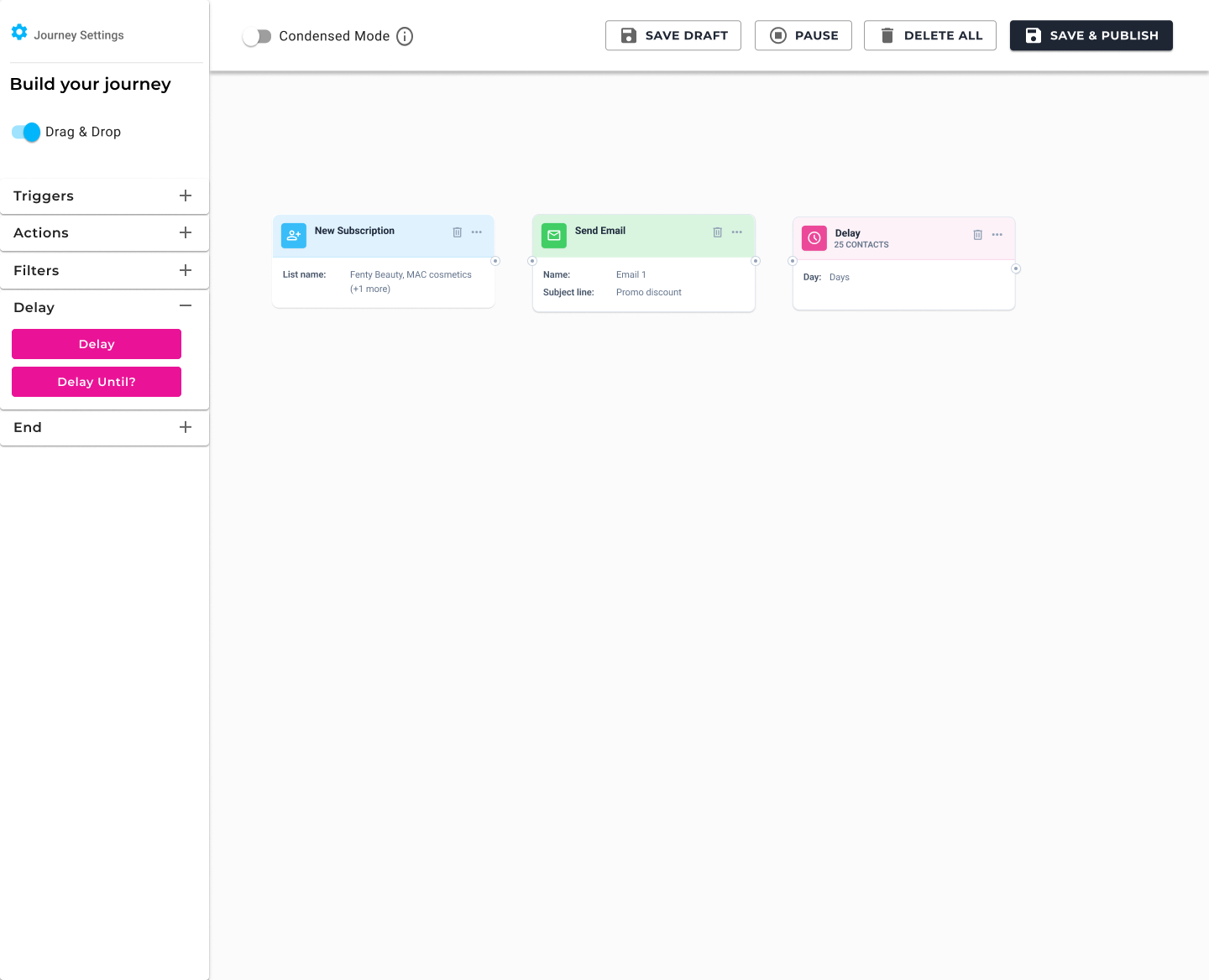
Colour chip, title, subtitle, facts, overflow, connectors. Triggers, actions, filters, delays, and ends all share it. That is how a multi-quarter Vue 3 migration stays coherent instead of becoming 33 one-off screens.
If a marketer has to open a node to know what it does, the canvas has already failed. Design principle for the new Journey Builder
The canvas is the product
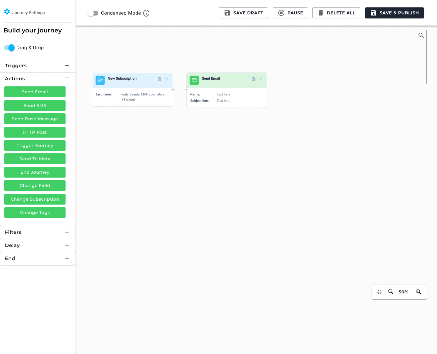
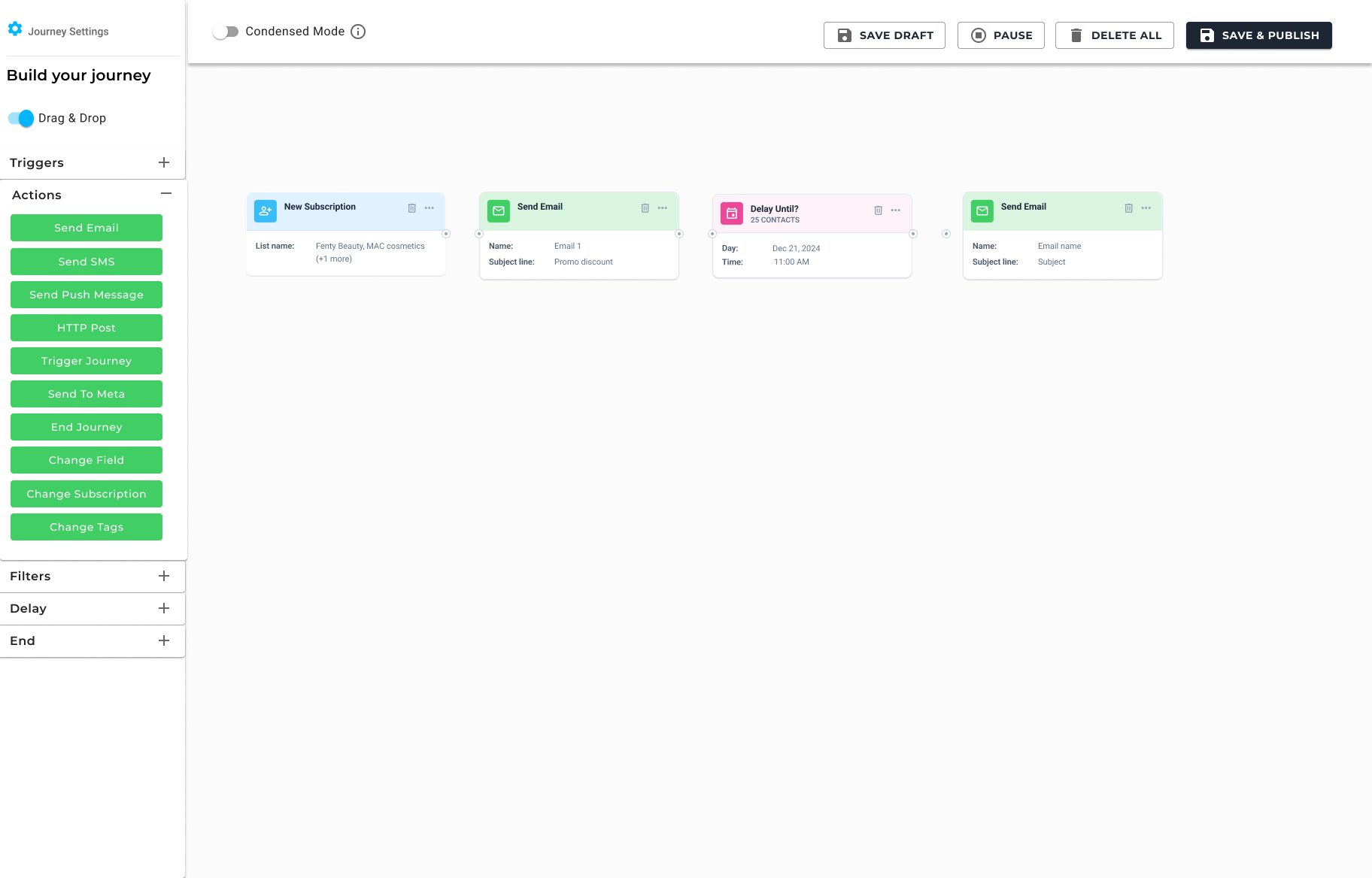
Everything else is in service of this surface. Status lives in the header – Condensed Mode, Save Draft, Pause, Delete All, Save & Publish. Zoom and fit sit on the canvas, not in a settings graveyard. Adding a step happens from the left palette, or from the plus on the canvas next to the work.
A node language, not 33 unique widgets
Marketers do not think in “components.” They think in jobs. Something starts the journey. Something happens. Something decides. Something waits. Something ends. Colour and structure follow that model so a new widget – Send to Meta, Case, A/B split – can join the family without a new visual dialect.
Configuration without losing the map
Opening a node used to replace the canvas. The new pattern is a right-hand inspector: title, one-line job description, the fields that actually change behaviour, Cancel and Save. The selected node stays visible on the left so the marketer is editing a step in a journey, not filling a form in a vacuum.
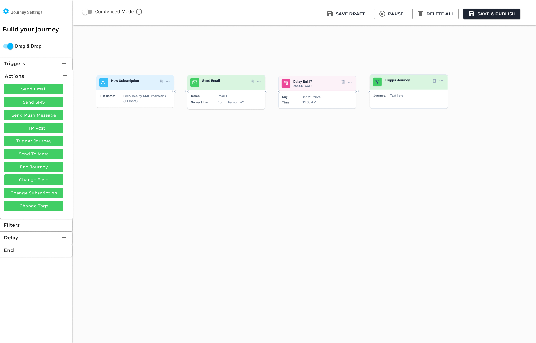
Two presentations. One journey.
Complex accounts do not have five-step welcomes. They have post-purchase maps with splits on buyer type, category, and wait windows measured in weeks. Card view is the working surface. Condensed Mode is how you still see the whole thing. Same nodes, same connectors, less ink. A header toggle – not a second builder.
Multi-select
Move a group, not a node
Command-Shift (or Ctrl) and drag a marquee. Whole branches relocate. The old canvas made you rebuild the cluster.
Connectors
Any side, not only east
Vertical stacks stop looking like a workaround. Yes/No and Case paths can drop instead of stretching across the board.
Status
The journey has a state
Active, paused, draft – in the header, not buried in a row action. Pause is a first-class control next to publish.
How a 33-widget rebuild actually ships
Product initially wanted an all-or-nothing launch because the canvas was unsafe to enable only partially. In practice, Welcome and Abandoned Cart are the journeys every customer already runs. I designed the system so the new canvas could go live on those templates while from-scratch and the remaining widgets stayed on the legacy builder. That is a product call, not a compromise on the visual language.
Welcome & Abandoned Cart
New canvas after the guided template. The first time most marketers meet the rebuild.
Nurture & Advocacy
Same canvas contract on the next two templates. No second pattern for “the other journeys.”
Remaining widgets
Triggers, actions, filters, delays, ends – still moving onto Liquid Sky so from-scratch can leave the old canvas.
Re-engagement & lapsed
More templates on the new canvas once the widget set is complete enough to author them without a fallback.
What lead-level work looked like here
This was not a set of mockups thrown over a wall. It was a multi-quarter platform change with a PM who was right to be nervous about ripping out a well-used tool, engineers who could not migrate all 33 widgets to Vue 3 in one release, and marketers who would feel every missing hover target.
Partner, don’t decorate
PRD to canvas language
The problem statement was competitiveness, security, and a legacy framework. I translated that into a node anatomy, zoom behaviour, and a template-first rollout so the PRD had a design it could actually sequence.
System before screens
A library engineering can trust
The component library is the handoff. If a new action fits the card contract, it does not need a design review for “where does the title go.” That is how you keep a 33-widget migration on-brand when you are not in every ticket.
Critique in public
Cross-functional feedback, then design freeze
Multiple drafts – including a full “present this” pass after product and engineering review. Condensed Mode, card density, and drawer vs modal were argued in the file, then locked. Exploration stayed on archived pages so Ready for Dev stayed quiet.
Change management
Do not dual-run forever
Segment Builder taught us that a legacy toggle delays adoption. New journeys on templates get the new canvas. Old journeys keep working. There is no “classic mode” to hide in. The way out is finishing the widgets, not maintaining two builders.
Process
Audit
Live UAT canvas, 33 widgets, and where Liquid Sky already stopped – index yes, builder no.
Frame
Competitive builders, marketer jobs, and the constraint that this cannot ship widget-by-widget as 33 UIs.
System
Node anatomy, colour roles, card vs Condensed Mode, drawer config, all-sides connectors. Then screens.
Sequence
Templates first, remaining widgets next, from-scratch last. Design the contract once; fill it over quarters.
What had to be specified, not implied
- Empty canvas, first node, add palette, and “where do I start”
- Card vs Condensed Mode in the header, not a hidden setting
- Multi-select, group move, and connector reflow
- Drawer config for every widget family – not a unique modal each
- Yes/No, Case, % split, A/B – filters that show their exits on the card
- Pause, draft, publish, delete – status and irreversible actions
- Template-generated journeys vs from-scratch, without two visual languages
- Handoff: component library as the source of truth for Vue 3
States the canvas has to survive
What I would look for after the rest of the widgets land
Templates proving the canvas is the start, not the proof. The questions after from-scratch moves over: do marketers still open every node, or do they trust the information on the card? Do they zoom out, or do they continue panning across a horizontal strip? Do support tickets about “where did my journey go” decrease? Do time to first published journey and time to edit a live journey improve on the legacy builder? That was the performance bar in the PRD, and it is the one that matters.
The Figma file is the contract. The product is whether a marketer can read an automated revenue machine without hovering.