
Service Cloud · Tickets
The queue became the workspace
I redesigned the Service Cloud ticket page from a spreadsheet you leave into an inbox you work in – list, conversation, and customer on one screen – so agents can resolve WISMO and returns without losing the queue.
Agents lived on Tickets. Tickets was a directory.
Support agents working in 10–50-person ecommerce teams spend the day on WISMO, returns, and order changes. The page they opened most was a ten-column table. Click a row and the queue disappeared. Order context lived in Commerce. Close dumped them back to the index. Every ticket was a round-trip.
That was not a visual complaint. The product outline already named the pain: switching tools to find an order, painful history, and a ticket screen that looked like nothing special versus Gorgias or Zendesk. Prospects bounced on first demo. Agents paid the tax in handle time.
The brief was not “restyle the table.” It was: keep the list and the ticket visible together, put the customer and the order in reach, and let an agent reply and take the next unread without leaving the page.
Product outcome
Stay in the queue. See the customer. Reply in place.
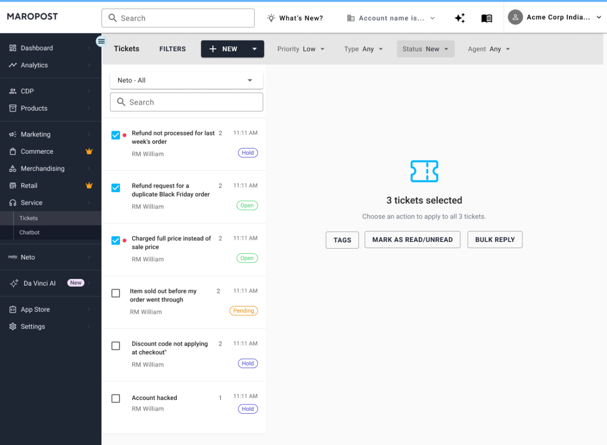
Three panes: a scannable queue with unread, SLA, and last message; a conversation with Reply, Note, and Forward; a customer card with linked orders. Bulk actions moved to the top. Inbox scoped the work. The table is gone because the job was never to administer rows.
Before, the experience was a spreadsheet; after, it became an inbox.
The old Tickets page was excellent at showing columns and terrible at supporting the work. Status and priority hid behind horizontal scroll. Assign, Close, and Delete sat under the table, often below the fold. The new page treats Tickets the way agents already think: a queue of conversations, not a report.
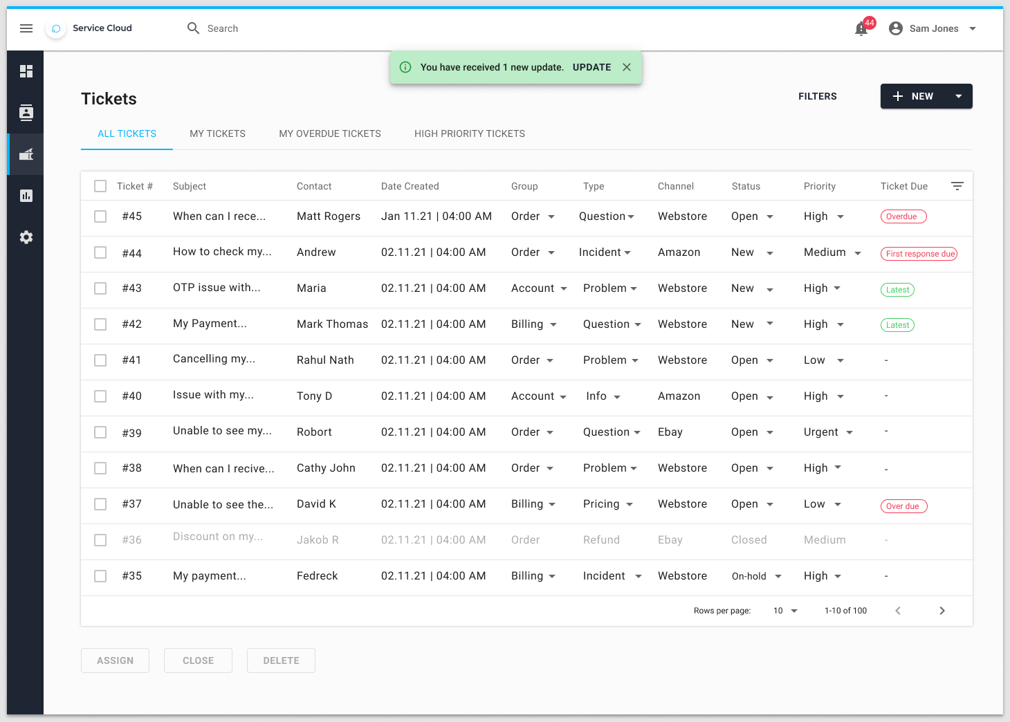
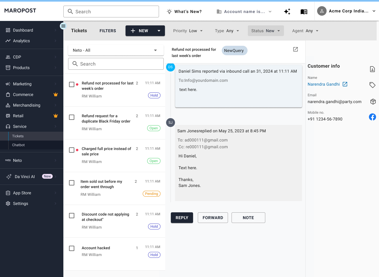
One ticket. Six hops – then one screen.
Persona: a support agent working for a Neto/Commerce merchant. Typical ticket: WISMO and return requests accounted for 43% of combined ticket volume. Goal: resolve without leaving the queue, and without opening Commerce in another tab.
Old
Decode ten columns to decide what is urgent. Horizontal scroll hides Status and Priority.
New
Unread dot, last-message snippet, SLA, channel, and status badge are on the row. Triage in seconds.
Old
Full-page navigation. The list vanishes. Place in the queue is lost until you come back.
New
Conversation opens beside the list. Selected row stays highlighted. Next and previous stay in view.
Old
Detail is conversation-only. Agent opens Commerce to find the order. Two tools, two mental models.
New
Right panel shows contact, LTV, and linked orders – item, paid, fulfilment – without leaving Service Cloud.
Old
Reply is a separate view. Changing status often refreshed the page and jumped the scroll.
New
Reply, Note, and Forward sit on the thread. Status, priority, and assignee stay on the ticket header.
Old
Close redirected to the index. Re-scan the table. Repeat the hop for every ticket.
New
Close in place. The list updates. Click the next unread ticket. The flow never breaks.
Old
Assign, Close, Delete under the table – easy to miss. No merge or spam in the primary bar.
New
Select rows and the top bar becomes Assign, Close, Merge, Delete, Spam, Move. Filters stay as chips.
If an agent has to leave the queue to work a ticket, the page has already failed. Design principle for the Service Cloud ticket workspace
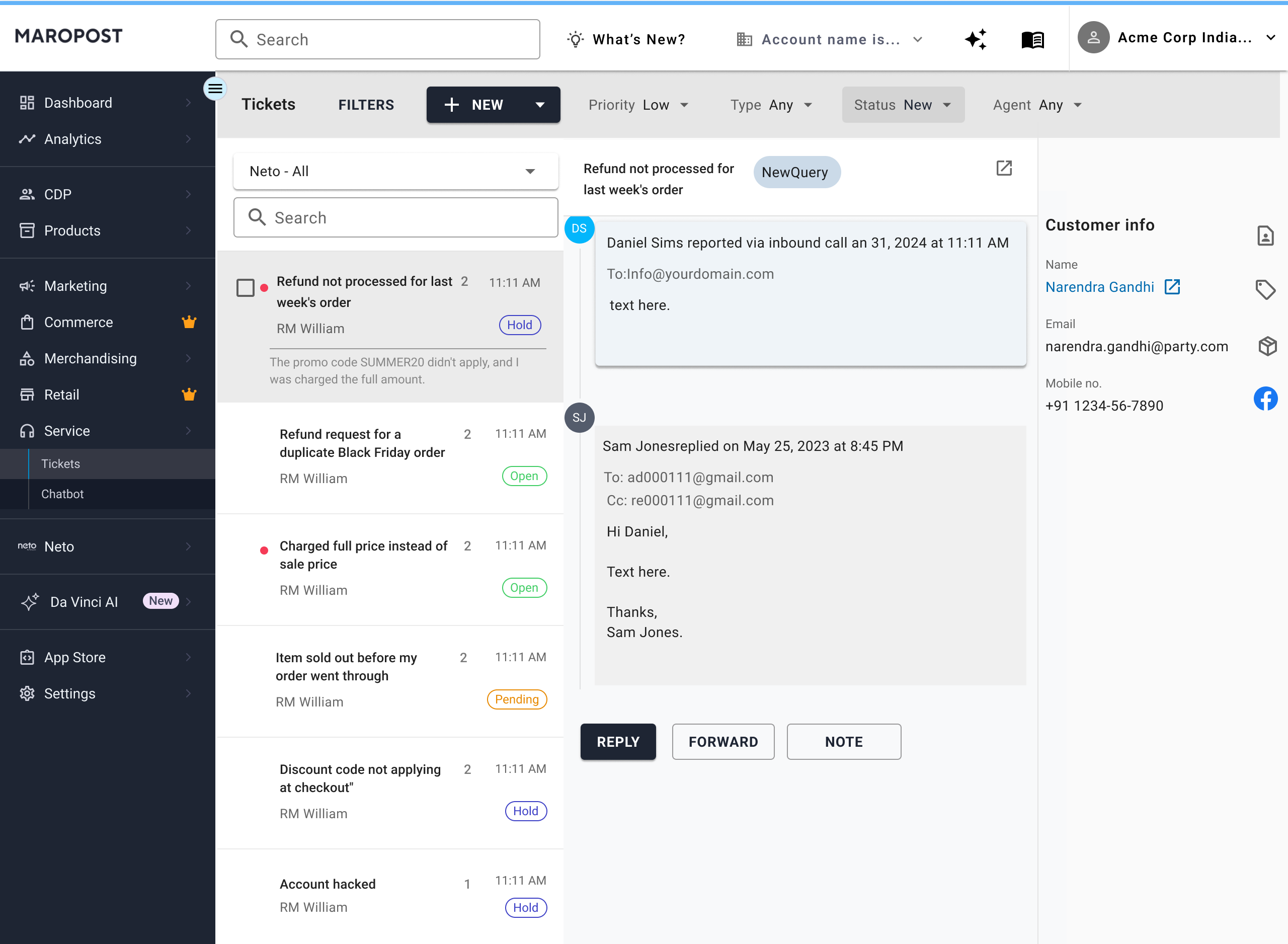
The last line shows on hover
The queue stays a scan: subject, agent, time, status. The ticket description is not in the row. Hover reveals the last customer line so an agent can confirm the ticket without opening it, and without turning the list into a wall of previews.
What this is for
The redesign is not polish. It changes the job: from “find a row, open a page, come back” to “work the queue.” That is the outcome to protect in UAT – list and ticket visible together, customer and order in reach, reply in place.
One screen
WISMO cycle that used to take six hops: list, detail, Commerce, back, reply, index.
Handle time
The design takes navigation and tab-switching off the critical path. That is what UAT should prove, not a reported metric.
First reply
Paid and fulfilment on the ticket should mean fewer “let me check and come back” replies. Hypothesis for UAT, not a result.
Demo
The ticket screen stops being a sales objection against Gorgias and Zendesk.
For the agent
Stay oriented
The queue never vanishes. Last customer message is visible before opening. Reply does not change the page. Bulk assign and spam do not require scrolling to a footer.
For the business
Support as a retention lever
Faster resolution on the two highest-volume types. Less refund delay caused by hunting orders. A ticket product that can be shown in a sales demo without apology.
Four decisions that made it a product, not a reskin
An early pass put a drawer over the same table. That met “side by side” on paper and still hid Status behind the panel. The final design stopped treating the table as sacred and designed the queue instead.
01 · Workspace, not drawer
Do not slide a detail over a spreadsheet.
A 50% drawer on a ten-column table still makes agents guess at hidden columns. The list became a conversation list so split view has something worth splitting.
02 · Recognition on the row
Unread, SLA, last line, status.
If you have to open a ticket to know whether it is waiting on the customer, the queue has already failed. The row carries the facts an agent needs to pick the next piece of work.
03 · Commerce in the pane
Orders are part of the ticket, not a deep link.
WISMO and returns are 43% of volume. Linking the order on the customer panel is how Service Cloud stops being a generic helpdesk.
04 · Bulk is a mode
Filters stay filters. Ticket actions move to the top bar.
Selecting tickets replaces the chrome with Assign, Close, Merge, Spam. Reading one conversation pauses until selection is cleared. Two jobs, one layout.
Process
Audit
Live table, full-page detail, bulk under the fold, and the agent pain already written in the product outline.
Frame
The list and ticket must remain visible together across responsive layouts. Order context in reach. Reply in place.
Iterate
Table-plus-drawer first. Then a true inbox: queue, thread, customer. Bulk and inbox selection on the same surface.
Handoff
The split-view workspace moved into UAT. Protect the workspace behaviour – not a restyle of the old columns.
What had to be specified, not implied
- Queue row anatomy: unread, SLA, last message, channel, status
- Selected ticket vs bulk-selected tickets – two modes, one layout
- Reply, Note, Forward on the thread – not a second page
- Customer card with linked orders, paid, fulfilment, history
- Inbox selector as the primary scope, chips as secondary filters
- Close in place – never dump the agent back to an index
- Narrow desktop: list + thread. Mobile: list, then full-screen ticket
- Empty, loading, no-results, and closed-ticket states on the same chrome